Mission
Our goal was to produce a marketing video that would highlight the key products and Topaz’s value proposition in a compelling, visually striking showreel.
Our goal was to produce a marketing video that would highlight the key products and Topaz’s value proposition in a compelling, visually striking showreel.
We produced a marketing video that highlighted the key products and Topaz’s value proposition in a compelling, visually striking showreel.
Within 2 months we quickly launched showreel. Stakeholders were very impressed with the outcome.
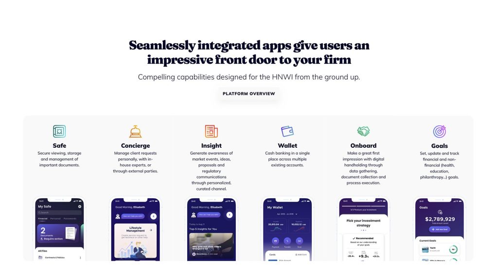
Topaz is a fintech platform that digitizes end-to-end wealth and life management for private banks, family offices, and external asset managers. The platform contains 11 products, which are connected and integrated into each other.
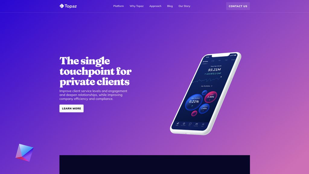
All products are based around finance management: bank accounts, documents, data, credit cards, etc.
Topaz’s full final product is still under development, so at that moment we were unable to create a full product demo video for customers, which will contain a detailed overview of the interface and features.
That’s why the client decided to start from a quick product showreel around 1 minute+ in duration. The showreel will quickly present the core value of all of these 11 products without overwhelming explanation.
Our team started figuring out a creative concept.
The key points we came to:

The general note is to show that Topaz brings a new level of experience in financial management to their clients.
The creative concept includes three main things:
With the help of these three tools, we are validating the idea, direction, and style.
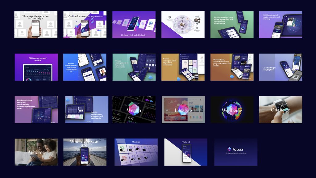
The initial storyboard was ready and after several iterations, we achieved a final look but saved an idea of UI animation combined with text animation of marketing messages.
A huge part of this project took a UI animation.
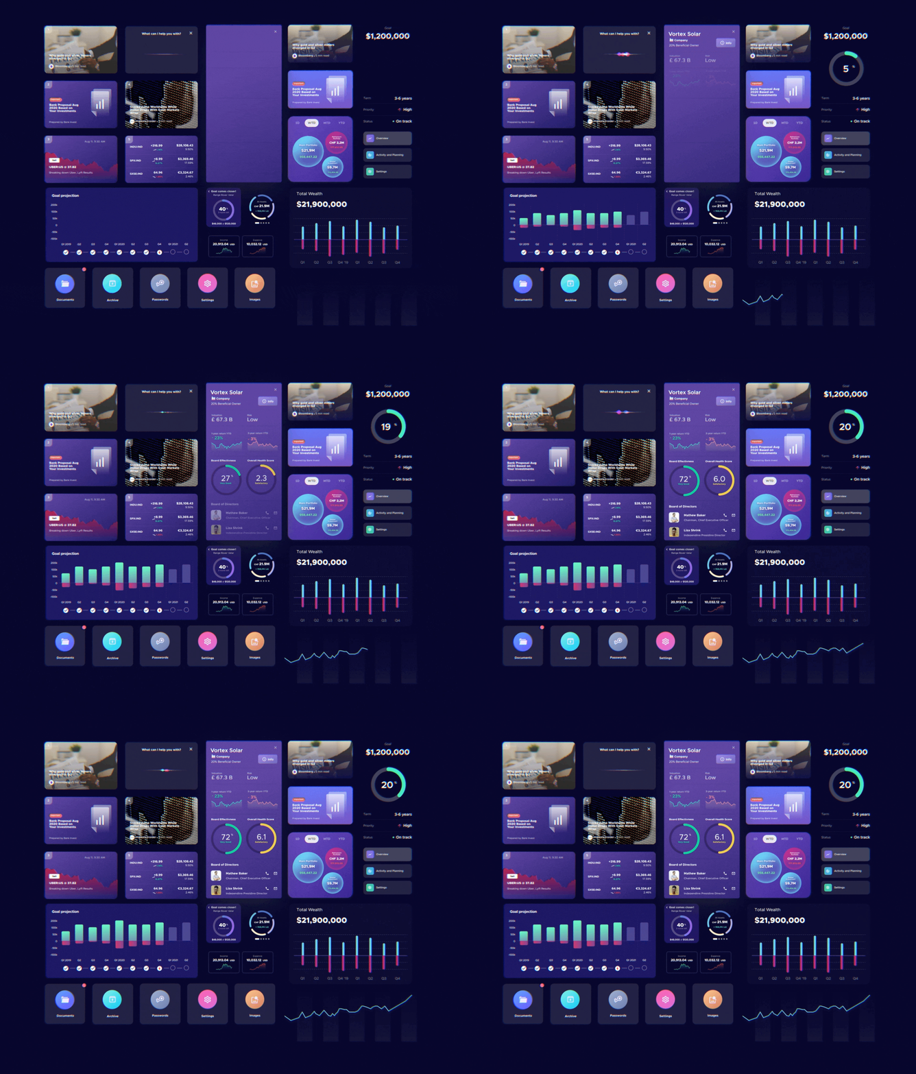
It was separated into a full milestone. Our team animated specific user flows across all products. We worked closely with the Topaz design team to implement all of these interactions for final compositing.

Finally, we crafted several styleframes to validate the look and feel with the client.


On this, the creative concept was finished.
We went to motion graphics, animation, and editing of each scene following the storyboard.

Last, but not least was a sound design.
We believe that sound is half of the success of every project we do, that’s why we pay a lot of attention to add atmosphere, support animation with sound effects to make the picture look complete.
The project was completed successfully.
Within 2 months we quickly launched showreel. The stakeholders from the client side were very impressed with the outcome.
As it usually happens, Galera tries to become a partner instead of the contractor. So we continued to work further on the next project, but it’s another story. Stay tuned and we’re excited to share it in the next case study.
If you like this product showreel and you looking for something similar to your business, feel free to say hello at hello@galera.agency or contact us by a form.
They commit to their task and pay close attention to detail. After regular check-ins, well-received feedback, and attentive storytelling about Topaz's branding, Galera launched the project within two months. We found their collaboration smooth and efficient. Internal stakeholders were also greatly impressed by the output.
